What is the best script font for tattoos?
Judged on skin instead of posters: even-weight casual scripts (Sacramento-style) and bold brush scripts survive best, because ink spread erases hairlines first and those two families barely have any. Ornate copperplate can be stunning at forearm size and mush at wrist size — the same “best” font changes verdicts with size. There is no universal winner; the honest filter is your exact word at your exact size, side by side.
Do script tattoos age well?
Better than their reputation, when three rules hold: letters sized one step larger than instinct, spacing opened beyond what looks elegant on screen, and placement on flat low-friction skin. A spaced script on a flat outer forearm can read clean for decades. The same word crammed on an inner wrist softens within a few years. Script doesn’t fail from being script — it fails from being small, tight and rubbed.
Do handwriting tattoos age well?
Casual handwriting faces (the Caveat/Homemade Apple lane) are among the best agers in lettering: near single-weight strokes, no hairlines to lose, and slight irregularity hides blur instead of amplifying it. One honest caveat — a real person’s handwriting, like a mother’s, often contains tight loops that a digitised font won’t fix. Have the artist open the spacing during redraw; that single adjustment decides how it looks in ten years.
Do cursive tattoos fade?
Cursive doesn’t fade faster in the needle — it fails visibility sooner because readable script depends on details that go first: hairline upstrokes, thin connectors, tight loop openings. A bold traditional line fading the same percentage just gets softer; cursive crossing that same threshold stops spelling words. The defences are size, spacing, placement, and an artist authorised to thicken the thinnest strokes before stencilling.
Why do some tattoos fade?
Four real mechanisms, unevenly distributed: sun UV breaks pigment particles fastest on frequently exposed skin; immune cells gradually carry ink away everywhere; hand-friction abrades knuckle and finger work; and shallow needle depth deposits pigment where it sheds within months. Sleep position does not erase a tattoo’s shoulder line — the friction myth oversold. Cursive’s thin strokes just make every mechanism more visible earlier than in bold work.
Why do tattoos fade to green?
Mostly a pigment-mixing story: black ink is a blend of pigments, and reds break down faster under UV than blues and greens, so old black can drift olive over decades — worst on sun-exposed neck and hands. Cheap or organic inks fade unevenly in other hues too. If an ageing cursive word turns swampy rather than soft, sun exposure is the usual suspect; daily SPF on the spot is the actual brake.
How much does a script tattoo cost?
Lettering bills by artist time, and clean script is specialised time: many shops price custom lettering above same-size pictorial flash because redraw-by-hand is the skill being bought. Expect a shop minimum for one small word, hourly for forearm-length quotes, and a genuine spread between shops — that spread usually tracks lettering portfolio quality, not brand. Touch-up policy is worth asking about before the price conversation.
How much does a small cursive tattoo cost?
Small doesn’t mean cheap: one wrist word is still a setup, a sterilised room and an hour of someone’s licensed time, so it lands near the shop minimum in most markets regardless of centimetres. Where the money goes wrong is cheap fast lettering — merged connectors you’ll pay to fix. A slightly larger quote with open spacing usually ages better per dollar than the smallest possible version.
Types of cursive fonts for tattoos?
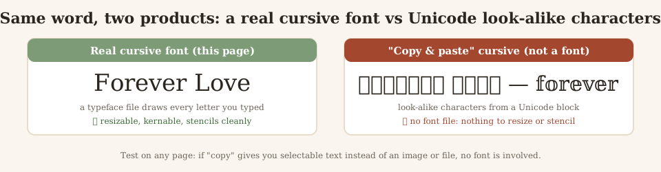
Four working families. Formal copperplate (Pinyon-style): dramatic thick-thin, needs real size. Wedding scripts (Great Vibes-style): flowing, legible, the name default. Casual handwriting: reads personal, ages forgivingly. Bold brush and retro (Kaushan, Pacifico): the men’s Chicano-adjacent lane and the best small-size survivor. Any honest generator labels which family each face belongs to — if a page shows twenty identical-looking “styles,” they’re one font resold.
What are good tattoo fonts?
On skin, good fonts share one trait: strokes thick enough that line spread can’t erase them. That promotes traditional flash lettering, Roman capitals, heavy blackletter and single-weight brush scripts — and demotes high-contrast serifs and hairline calligraphy, the two styles artists warn about most. A second underrated filter: does the font’s spacing stay open at your size? Goodness is relative to centimetres and placement, not to the alphabet sheet.