Tattoo Fonts for Names — Type the Real Name Once, See It in 12 Real Fonts
A name is three to eight letters and nothing else: the typeface carries the whole meaning, so generic “best tattoo fonts” lists sample words that will never appear on you. The grid below renders your actual name — true spelling, true capitals — in twelve open-licensed fonts, live in your browser, free. Then it tells you the name-specific things font pages skip: which letter pairs merge, whether to read it vertical or horizontal, and how small is too small.
Rendered with real open-licensed typefaces, drawn in your browser. Nothing is uploaded, nothing is stored. Loading fonts…
Found the one it should be? Screenshot it at your slider size, then put the lettering on a photo of your skin — screen size and skin size are different questions — and hand both files to your artist via the stencil generator.
A Name Is Not a Sample Word: The Three Audits Before Any Stencil
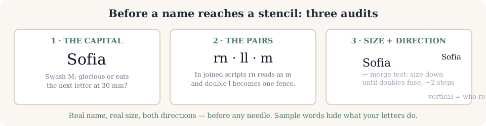
1 · The capital decides the word. Script fonts are judged on lowercase, but your name is read by its first letter. Some swash capitals are glorious at forearm size and strangle the next letter at wrist size; the same M can carry a name or eat it. Type the real first letter — that’s exactly why the input above starts with your word, not “abc.”
2 · Letter pairs collide. In joined scripts, rnreads as m, double l becomes one fence of strokes, and some connector tails cross neighbours. Every human name contains at least one risky pair — find yours in two fonts minimum before you like either. This is the step that a copied Unicode “cursive” can never show you, because those aren’t letters from a font at all.
3 · Your size, not the screen’s. Drop the slider until your doubles merge, then size up two steps. Names in high-contrast script blur from the hairline down first; a monoline casual script at the same millimetres stays a word. The centimetre verdict happens in the simulator on a photo of the actual spot.
“Vertical” Is a Real Search — and Almost Nobody Answers It
Autocomplete feeds “tattoo fonts for names vertical” to a page of horizontal font grids. Direction changes the decision more than most fonts do, because it changes who reads the name and how a joined script behaves when letters stand in a column.
Horizontal names
The default for collarbone, chest over the heart, ribs and inner forearm. Body lines already run sideways there, so joined scripts keep their natural connectors. Judge it in a mirror: the inner forearm reads right-side-up to strangers and upside-down to you — pick whose reading matters before the font.
Font note: wedding scripts and copperplate hold their rhythm horizontally; that’s where they were designed.
Vertical names
Spine, outer-forearm drop, behind the ear. Two traps font grids hide: capital swashes stack differently in a column, and joined scripts look broken when the baseline goes vertical — most “vertical name” tattoos that work are actually monoline letters spaced as words, not a horizontal script rotated.
Font note: Sacramento and Roman caps survive the column; Great Vibes connectors rarely do. Test both directions before booking.
Whose Name Is It? The Search Splits Three Ways
“For girl,” “for men,” couples and memorial names all share this query — and each one wants a different lane of the grid above, not the same wedding-script list.
A partner’s name
Flowing scripts (Great Vibes, Alex Brush) carry the vow feel. Keep it sizeable and lettering- based so it stays coverable — the honest breakup insurance is design, not denial.
A child’s or family name
Handwriting lanes (Caveat, Homemade Apple) read as personal rather than designed. For a child who will sign their own name one day, many people skip fonts and trace actual handwriting — that’s a photo-transcription job, not a font job.
Your own / a surname with weight
Roman caps and blackletter (Cinzel, UnifrakturMaguntia) read as heritage and hold stroke for decades. Check length first: surnames crowd scripts the way first names don’t.
Not only names?
The full font generator — quotes, dates, and the three-kinds-of-“generator” fork explained.
Script fonts specifically?
The 12-face script & cursive grid plus the copy-button test that exposes fake Unicode “fonts.”
Shortlist ready? Who reads it?
Put the name on a photo of the spot, mirror-check it, judge real centimetres free.
Wrist? Finger? Rib?
Small lettering lives or dies by skin: friction and stretch data per spot before you lock size.
Name-Font Questions People Actually Type
What are good tattoo fonts for names?
Good name fonts are the ones that survive three checks: your exact capitals, your letter pairs, and your target size. Connected scripts (Great Vibes, Alex Brush) suit partner and family names; monoline scripts (Sacramento) survive small sizes best; blackletter suits surnames with weight. There is no universally best face — type the real name into the grid above and let the specific letters decide. Generic “top fonts” lists rank by how a sample word looks at poster size; names live and die at 25–50 mm.
What is the best tattoo font for a last name?
Surnames are usually longer, all-caps-friendly and carrying family weight, which moves them away from dainty wedding scripts. Roman capitals (Cinzel) read as inscription and age superbly because every stroke is even weight; blackletter (UnifrakturMaguntia) carries the traditional Chicano-heritage surname look; a clean typewriter face reads quiet and modern. The last-name trap is length: over roughly twelve letters on a collarbone or forearm, ornate scripts crowd together — test it at your real size in the grid, not a sample word.
What font is used for tattoos?
Shop lettering mostly comes from four wells: flash-style script (the Great Vibes family), traditional American block serif, blackletter/Old English, and hand-drawn custom lettering that isn’t a font at all. Here is the part font sites won’t tell you: serious shops redrawing name work rarely paste a digital font — they draw the name by hand to follow the body’s curve. A font preview is the language you use to ask for that, not the file they trace. That is why this page keeps the honest lane split.
How small can a name tattoo be and stay readable?
Working floor that lettering-focused artists give: lowercase around 5 mm for clean even-weight lettering, and 8–12 mm where the face carries hairlines, swashes or dense joins — a script’s whole character lives in its thin connectors, and those are the first strokes to soften shut. Long names eat width fast: eight letters at a modest size already runs 5–6 cm, and a full name at legible script rarely fits a wrist. The practical test before your appointment: merge point — slide the size down until your real name’s doubles fuse, then go two steps up from there. Fingers, wrists and ankles wear fastest, so names there sit at the cautious end of any range.
Are name tattoos a bad idea?
The risk people mean is breakup, and fonts can’t fix that — but two design choices reduce the regret surface: keep it small and private enough to laser cheaply, and keep it lettering-based so an artist can modify or cover it far easier than photoreal work. Memorial and children’s names don’t carry that risk, which is why the same search splits into wedding scripts and handwriting lanes. What is genuinely a bad idea: a partner’s name in hairline script on a finger, because both failure modes arrive at once.
Can I copy and paste a tattoo font for a name?
You can copy fancy Unicode “script” characters into a text message, and some sites sell exactly that for names searches — but what arrives at the shop is not a font: no file to scale, half of phones render it as boxes, and the artist must redraw it anyway. It works as a mood reference at best. The honest version: type the name in the real renderer above, screenshot two finalists at your chosen size and spacing, and send those images — a picture of a drawn name tells an artist everything a copied symbol hides.
Should a name tattoo be vertical or horizontal?
The dropdown searches this and almost no font page answers it. Horizontal suits collarbone, chest and rib lines where the body’s own line is horizontal. Vertical suits the spine, the outer forearm drop and behind-the-ear placements, but flips the reading problem: a vertical name reads to others as you walk past, while you see it sideways at your desk. Two more vertical traps: capitals stack differently when letters stand in a column, and joined-script connectors look odd broken across a vertical axis. Decide direction before font — in the simulator, turn your own photo and read it both ways.
Two names you like? Put them on the spot
One photo, both screenshots, horizontal and vertical. Free, no sign-up.
Open the Simulator